


How to Create eCommerce UX Design That Drives Conversion
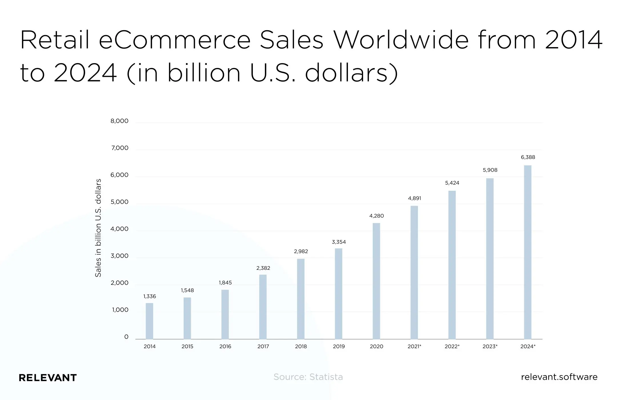
Global e-commerce keeps growing fast. Retail e-commerce sales are on track to pass $7 trillion in 2026. That is a huge opportunity, but it also means competing with countless other stores. So how does your company stand out in such a crowded market?
The success of your eCommerce solution, whether a website or a mobile app, depends on many factors, and design is one of the most important. When every element has a clear purpose and works well, it delivers a better user experience and, in turn, more sales and revenue.
If you plan to create a great eCommerce design, you will obviously need some UX tips. So here they are. As a software development company with significant experience in web design and UI/UX strategies, we’ve compiled everything you need to know about excellent eCommerce UX app design and why it’s better to outsource it.
What is the role of UX Design for an eCommerce project?
The eCommerce world is a highly competitive environment, and simply offering a product or service here is not enough. The buyer must differentiate your brand from the competition and become sort of emotionally attached to your product — because of the personalized experience you provide.
Users are more likely to return to an eCommerce store that ensures a simple, logical, and enjoyable shopping experience. Therefore, you must optimize every element — from website structure to product details — for your customers to get exactly what they want. That guarantees not only a second purchase (by the way, repeat customers spend 67% more than new ones) but also a higher basket value.
While a beautiful website alone doesn’t generate big sales, excellent user experience eCommerce helps drive conversions and turn users into loyal customers.
UX design for eCommerce: The recent trends
Leading companies are becoming more daring and innovative in their strategies. We bring you a list of the coolest eCommerce design trends in 2026 so that you can keep up with them:
- Vertically aligned menus for mobile responsiveness
- Unconventional layouts for longer user experience
- Sophisticated voice user interfaces for making purchases using voice commands
- A holistic eCommerce experience by adding new products and expanding into related markets
- Virtual and augmented reality for enhancing multisensory digital experiences
- Bright, bold colors to stand out from your competition
- Animated content for a better user experience
- Video or 360-degree visualization for full interaction with the product
With these UX design trends in mind, you can turn your eCommerce site into a delightful experience for anyone interested in your product.
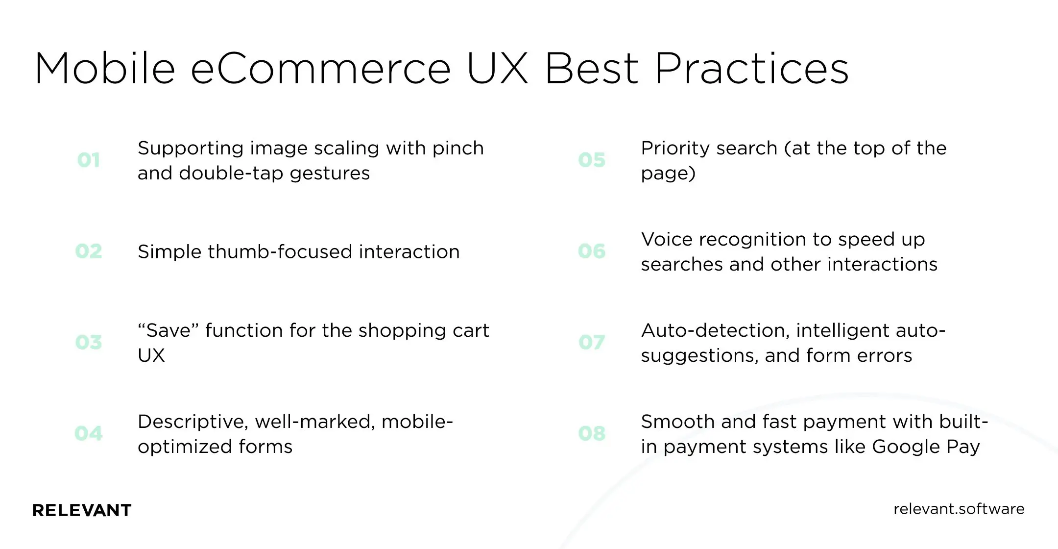
Mobile eCommerce UX best practices
Mobile now drives the majority of eCommerce sales, well over 70% of the total, so UX specialists design for mobile first.
But mobile eCommerce has its own rules and requirements for great UX. Here are some of the must-haves in mobile eCommerce usability:
- Supporting image scaling with pinch and double-tap gestures
- Simple thumb-focused interaction
- “Save” function for the shopping cart UX
- Descriptive, well-marked, mobile-optimized forms
- Priority search (at the top of the page)
- Voice recognition to speed up searches and other interactions
- Auto-detection, intelligent auto-suggestions, and form errors
- Smooth and fast payment with built-in payment systems like Google Pay
Following the mobile eCommerce best practices outlined above will help you create a more successful mobile eCommerce experience in your retail software solutions.
The best practices for creating a design for eCommerce
People continue to go to brick-and-mortar stores because they can interact directly with the products they want to buy. It’s the only thing that online shopping cannot provide. But as practice shows, with the right UX elements, your online store can visualize the customer journey and create a shopping experience as close to reality as possible.
A good user interface requires more than just a beautiful design. It includes many harmonizing components to help visitors navigate your site and efficiently reach their goals. So you must sustain it in a single stylistic concept that will support all aspects of UX. Here are the elements you should keep in mind in this perspective:
- the choice of colors that match the brand image and enhance the emotional response
- the style that matches the nature of the commercial offer (when visiting the site, people should immediately understand whether it sells fresh vegetables, fashionable clothes, or exclusive devices)
- the visual hierarchy that makes the main areas of interaction visible
- the overall harmony of perception evokes a sense of aesthetic satisfaction that sustains a positive user experience
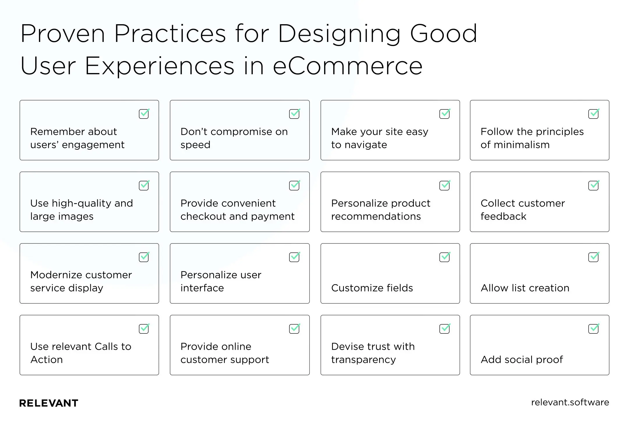
Eager to discover more design insights? Let’s look at a few proven practices for designing personalized user experiences in eCommerce.
Remember about users’ engagement
Engaging customers in emotional relationships beyond simple transactional purchases helps strengthen the bonds between them and your company. Therefore, it is essential to organize the interaction to motivate customers to use it regularly.
Tip: Combine users’ daily routine and emotions by organizing promotions, discounts, or coupons to increase engagement. Loyalty and referral reward programs will serve the same purpose.
Don’t compromise on speed
In eCommerce, a slow-loading website may cost you a lot. Experts point out that if an eCommerce platform earns $100,000 per day, one second of page delay will cost it $2.5 million in lost sales each year. Ideally, your site should load within three seconds, or even two seconds if it’s an eCommerce site. The two to three-second mark is a turning point where skyrocketing bounce rates. And 40% of consumers will leave your site if it takes more than three seconds to load.
Tip: For starters, try to reduce the number of redirects and optimize your images. We also recommend improving server response times by looking for performance bottlenecks and using software to compress CSS, HTML, and JavaScript files.
Make your site easy to navigate
A visitor may look at your website for no specific purpose, but good site navigation can prompt them to purchase. So show your users:
- the location of the main menu.
- the page they’re currently on (and how to return to the previous or home page).
- where is the search box located (the icon should be visible at the top of the page).
- where to find more product information.
- how to choose different product options.
- where to find all filters (commonly on the left).
- how to save items in the wishlist and more.
Tip: Make your eCommerce navigation UX sticky, so it always appears on users’ screens, even as they scroll down the page. So you can improve engagement and get more clicks on your content.
Follow the principles of minimalism
The art of less is trending in eCommerce because minimalist websites are easier to adapt to and load faster. Another important argument is that minimalism allows users to focus their full attention on the product or service you are selling.
Tip: Use the whitespace, easy navigation, and large fonts for increased accessibility. But don’t hide important navigation buttons in favor of minimalism — this makes the user experience awkward.
Use high-quality and large images
When it comes to sales, product photography is the go-to argument. Many buyers “look through” product photos carefully before making a decision. Hence, having the right product images can make a difference for fast and confident conversions.
Tip: Increase the image size and quality for good product page UX. Even category pages containing many tiny product images now use larger images. That lets users see all essential product details early in the buying and comparison process.
Provide convenient checkout and payment
According to the Paypers report, 56% of respondents expect various payment options presented on the checkout page. You can improve your conversion rates on mobile devices by offering different payment options. Plus, if customers can save their billing information on your site, they’ll be able to checkout faster on their next purchase. For instance, when apparel retailer Anthropologie redesigned the user interface and simplified the checkout process, sales jumped 24%.
Tip: Remove any distractions from the checkout page.
Personalize product recommendations
These recommendations can help you guide users to the right products and allow them to discover new ones, potentially increasing their average order value and creating a better user experience. For example, you can add recommendations in a section titled “Customers who bought this product also order…”.
Tip: Add “bestsellers” or “trends” sections. They work because they offer verified social proof. That leads customers to think that if others liked these products, there is a reason for it, and these are the best items to buy.
Collect customer feedback
Feedback forms and visitor surveys can help you understand how users perceive your UX. Create short forms that are shown to users immediately after completing the transaction. We recommend offering an incentive to complete the questionnaire.
Tip: Don’t be afraid to ask your customers what they need. By getting feedback from existing clients, you can better understand eCommerce UX trends and make more specific plans for the future.
Modernize customer service display
The design of any website changes and updates over time (particularly to resolve UX debt), but this is often not the case for the website’s customer service and support section. In this case, clients may wonder if the policies are relevant or question the accuracy of the information provided.
Tip: Remember that you are not tracking abstract metrics — all numbers in the conversion report refer to real people. Design an interface that considers their time, effort, and needs and brings a positive shopping experience for both parties.
Personalize user interface
Personalization is now at the heart of all online store optimization methods, as it helps brands establish constructive relationships with customers and understand what visitors want. That is especially important in the online marketplace, where customers have an almost endless list of options to choose from. Unsurprisingly, 45% of organizations have personalized their homepages, according to Evergage’s study.
Tip: Increase the level of personalization that you currently offer. Keep the place on the page where your customers have stopped during their previous visit. Users who get distracted while searching should be able to pick up where they left off.
Customize fields
While personalization is a fantastic tool for building loyalty, a more recent trend that is taking the eCommerce world by storm is customization. Reddit and the BBC are great UX examples of customization, as they offer users the ability to control their interactions with the site.
Tip: Let users choose what they want to see or set preferences for how you display and organize information on your eCommerce website.
Allow list creation
By giving your potential customers the option to save an item to a list and view it later, you increase your chances of converting. Amazon, Kohl’s, and Macy’s are using this tactic to their advantage to offer their visitors a better user experience.
Tip: Allow users to create their lists to sort products in different ways, based on their preference or the product they want most. These listings can help narrow down the number of products these shoppers can view when they’re ultimately ready to make the purchase.
Use relevant Calls to Action
It’s also essential to always include a clear, well-written, and well-displayed call to action (CTA) in every element to avoid losing traffic at the very end of the buying journey. For example, Home Depot’s Buy section has a performance of 98.4. They include clear calls to action such as “buy now” or “add to cart,” which increase conversions.
Tip: Don’t force people to subscribe; your conversion rate will crash.
Provide online customer support
Besides providing as much detail as possible on your pages, you also need online support. Although the effectiveness of the “Can we help you?” pop-up is controversial, as it can annoy visitors, you should always be ready to answer questions about the product, delivery, or other details.
Tip: Good customer support UX options include live and voice and video chats, support services, chatbots, and more. There are ready-made solutions you can integrate into your eCommerce site.
Devise trust with transparency
The more transparent your website becomes on product details, exchange and return policies, and company policies, the more trust you receive from your visitors. Transparency can help your visitors feel more confident buying, knowing they have everything they need to make an informed decision. According to Forbes, over 90% of consumers say that brand transparency is important to their purchase decisions.
Tip: The key places where you want to be as transparent as possible are product pages, which are important for increasing conversions.
Add social proof
Social proof can represent customer testimonials or the number of followers on social media or email. Any data that shows support and interest can help you build customers’ trust and loyalty. That will reduce potential doubts or concerns about your products, which will improve the user experience.
Tip: Allow customers to use their Google or Facebook accounts instead of creating a new profile.
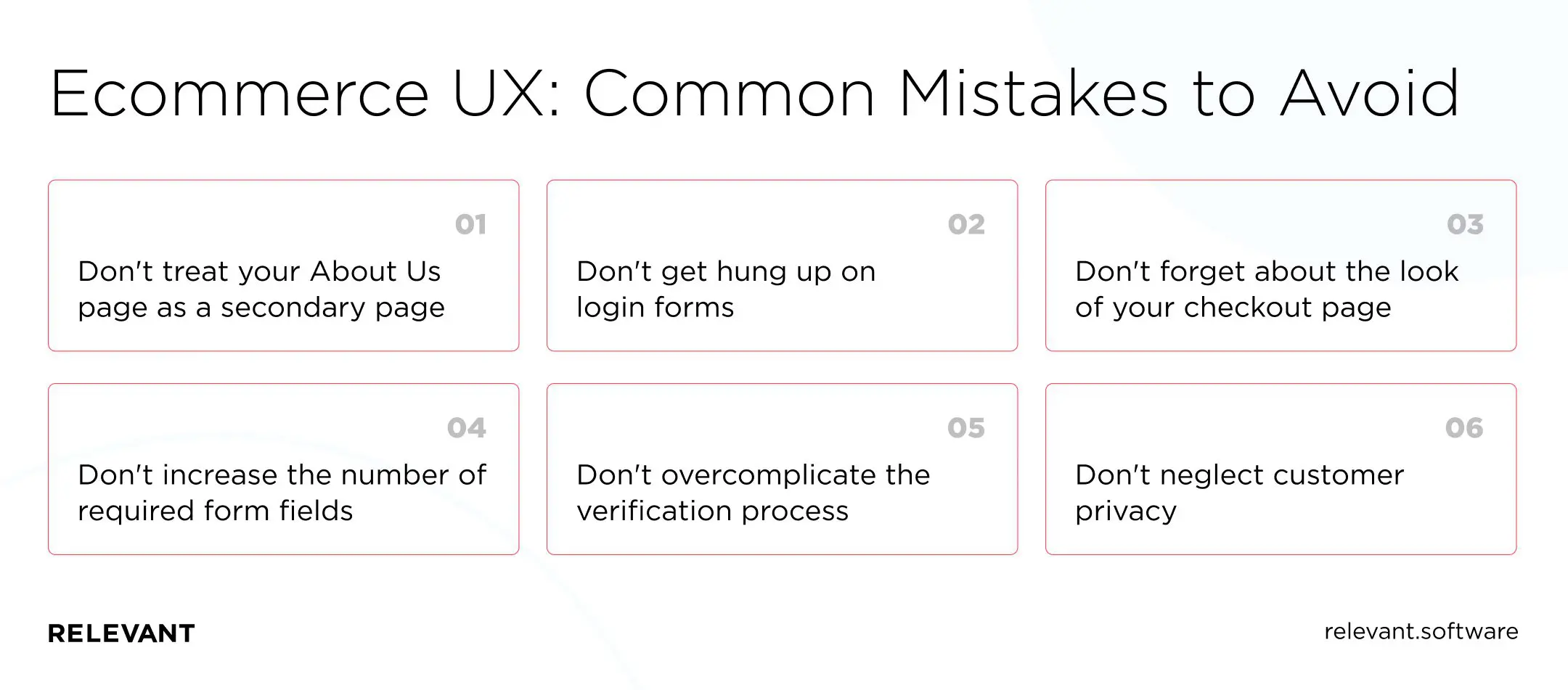
E-commerce UX: Common mistakes to avoid
Now that you know how to optimize your eCommerce website UX, you need to learn what NOT to do to avoid losing a conversion.
- Don’t treat your About Us page as a secondary page, especially if you’re in a B2B eCommerce business. Because 52% of business buyers say, the first thing they want to see on a seller’s website is an About Us page.
- Don’t get hung up on login forms. They should be short, progressive, and have minimal friction. Ask the buyer to provide basic information (email/password) first, or even log in to one of their social media accounts. Each additional step during registration increases the chances of a churn.
- Don’t forget about the look of your checkout page. Also, enable “guest pay” for new customers and invite them to create an account with you after completing their purchase.
- Don’t increase the number of required form fields. On average, eCommerce sites use 12.8 fields at checkout. But you can collect all customer data using 6 to 8 fields.
- Don’t overcomplicate the verification process. The more tedious the steps to place items in the cart and checkout, the more likely customers will leave the page without completing the transaction. All the functionality associated with this part of the store should be, on the one hand, extremely hidden, and on the other, simple and intuitive.
- Don’t neglect customer privacy. Your website will be more authentic with a digital certificate and have an encrypted connection that protects your customers’ privacy.
Top 5 eCommerce websites with great UX design
Besides being major eCommerce platforms, what do Asos, Amazon, and Walmart have in common? You guessed it — these are great, conversion-optimized website design examples. Here are the tricks these websites use to entice visitors to purchase:
Asos
Asos UX design starts with a unique value proposition. Great image, simple explanation, a “free shipping” guarantee, and clear calls to action that guide you to the right place. One standout UX feature is the video insert, which allows visitors to see what the clothes look like. That gives shoppers the best possible overview of the products and confidence in their purchase. ASOS also has a nifty feature called Quick View. That is a small pop-up window with additional images and all the information you need. That saves the client from going back and forth on different pages.
Amazon
Amazon is the world’s largest eCommerce website and probably one of the best. From vertical navigation links to customer recommendations, they meet their users’ needs. We can cite any of its features as examples of successful UX design. However, today we will highlight their one-click ordering system. After entering payment and shipping details, you can shop with one click.
Zara
Zara’s website is a true masterpiece in design — clean, intuitive, and concise. It is a living embodiment of Hick’s Law: a design principle that limits navigation choices and offers the user clear but limited options. Too many options overwhelm visitors, while fewer options make them feel more confident.
Walmart
Walmart completely redesigned its website a few years ago. They redesigned the eCommerce platform dashboard and invested heavily in UX, improving the shopping experience. The most significant change became improved personalization, both individual and regional. Users now see recommended products based on their purchase history, search results, and popular websites in their area. Since then, Walmart’s eCommerce sales have grown 33%.
Adidas
Adidas surfaces new and popular products without clutter, then supports fast discovery with clear filtering and sorting. That UX detail matters because Baymard found that 57% of e-commerce sites still miss at least one of the five essential filter types shoppers rely on. Over time, cleaner journeys improve conversion and retention, while stronger performance also supports search visibility through Core Web Vitals.

Top 5 reasons to outsource your UX Design
There are many things you might not want to outsource: analytics, marketing, financial processes, and even customer success management. But design, like development, was never on this list. All design and development companies can work as outsourcing specialists: only from a lesser or greater perspective.
There are several reasons outsourcing is the best option for e-commerce companies. The most important one is the significant cost savings. You save on employee salaries, adaptation costs, retention, insurance, and training. However, beyond cost savings, there are other reasons for the popularity of UX design outsourcing. In particular, it allows you to:
Keep up with the latest trends
UX design is in constant evolution. So, outsourcing companies regularly monitor current trends and learn new skills to compete in the market. You will gain skilled professionals who outsource your UX design and deliver an intuitive digital experience aligned with new UX and usability principles.
Access top design experts
Outsourcing UX design, for example, to Relevant is always a collaboration with the best talent. Given outsourcing, our dedicated development teams have many projects in their portfolio and knowledge that positively affects your project. Having a diverse background in UX design will provide a solid foundation for the future of your digital product.
Stick to flexibility and scalability
UX design work can fluctuate throughout the year. When starting a new project, the workload for UX designers is usually high but can decrease after some time. Working with an outsourcing company, you can reduce your team size. Meanwhile, you become more flexible and increase your scalability, which allows you to allocate your internal resources more efficiently.
Save time
Experienced UX specialists working only on your project enable you to optimize time-to-market for a product that benefits your business. You spend less time on administrative tasks. By outsourcing, you can be confident that a team of experts will deliver excellent results within the time frame for your product.
Focus on your core business tasks
One of the top reasons for outsourcing UX design is that the outsourcing company provides your customers with a great user experience. In turn, you can focus on your products or services, business strategies, and processes.
Wrapping up
Keep in mind that great UX design isn’t just about aesthetics. It is about making sure that visitors can easily surf your site and make purchases with pleasure. Thoughtful UX/UI optimization can dramatically improve the key metrics important for your business, from revenue to retention.
Why should you choose us? Because a dedicated team from Relevant can design a user interface to meet all of your audience’s needs. Our user-centric designs feature intuitive navigation, visual appeal, and logically organized content. Our UI/UX design services include:
- Digital product design
- Experience & UI design
- Graphic & motion design
- Visual identity
If you need to perform an eCommerce UX audit or realize an eCommerce platform redesign, Relevant is here to help. If you are looking for experienced designers or want to hire a software development team, contact us today, and we will start working on your project as soon as possible.


