


![SaaS Design in 2026: Best Practices for Creating an Awesome Product [+ Case Study]](/_next/image/?url=%2Fmedia-webp%2FSaaS-Design-in-2022_Cover.jpg.webp&w=3840&q=75)
SaaS Design in 2026: Best Practices for Creating an Awesome Product [+ Case Study]
Few industries are as popular as SaaS (Software-as-a-Service). 99% of organizations are already using one or more SaaS solutions. High demand generates strong competition, so there is a lot to choose from in the SaaS market. Therefore, if you want to offer something special, then it must be a really outstanding product with awesome SaaS design that can impress your potential customers at first glance.
Besides the unusual idea and innovative features, a great SaaS product should also have — yes, you are not mistaken, a well-thought and attractive user interface design. That is one of the most crucial steps to reaching your audience and making your product take off!
But how do you put this winning design into practice? As a company providing SaaS development services for over eight years, we know the answer to that and will be happy to share it with you. In this article, we’ll go over everything you need to know about SaaS product design and list the top-performing trends in UX so that you can create an amazing product.
Designing a SaaS product: The essentials
The reasons why the SaaS model outperforms other delivery models are pretty clear. It offers many benefits, such as cloud storage, lower computing space requirements, cost flexibility and predictability, on-demand functionality, and more. At the same time, improved user experience and accessible interface are something that SaaS providers must deliver by themselves.
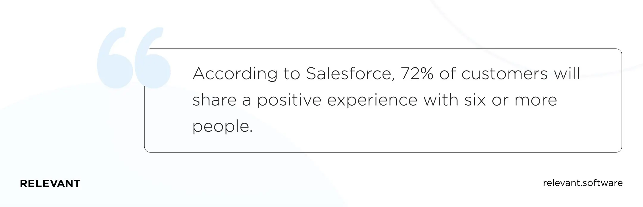
According to Salesforce, 84% of customers say a company’s experience is as important as its products and services. Also, people value good expertise: 72% of customers will share a positive experience with six or more people. But if the users are disappointed, they will quickly go to competitors, which are always there, waiting to bait your clients.
Design and user experience are among the essential aspects of SaaS. Even if you are just entering the market and no one knows you, these things matter. Everything should work flawlessly and look good because users do not forgive the poor quality of any kind.
Grand design can attract customers and help them interact with your product and return to it repeatedly. How you balance functionality, performance, utility, and value will determine your user experience in the first place. What’s more, embracing the best design practices just from the start will help you build a more esthetical, more usable product, which in turn will help you faster achieve your big business goals.
It is better to immediately optimize the SaaS infrastructure design for mobile devices for the same reasons. When creating a responsive SaaS design, think about mobile app development. Note that Google crawls the mobile version of your site first, not the desktop, to determine your page rank. The app often provides better performance and a more manageable user experience. More importantly, it helps improve retention, as users are more likely to return to the app than to a browser bookmark.
Your interface should be good enough for users to prefer you over your competitors. Let’s take Airbnb and Booking as examples. One of the widely recognized advantages of Airbnb is its simple and easy interface compared to old-school Booking. Therefore, be sure to study at least two or three of your product’s best competitors.
What are the best practices for creating a design for SaaS products?
Statistics show that users often rate SaaS companies based on the quality of their websites. A careful analysis of the best SaaS sites suggests that the design of a SaaS application must still adhere to certain standards and trends that make a website better and more user-friendly by default.
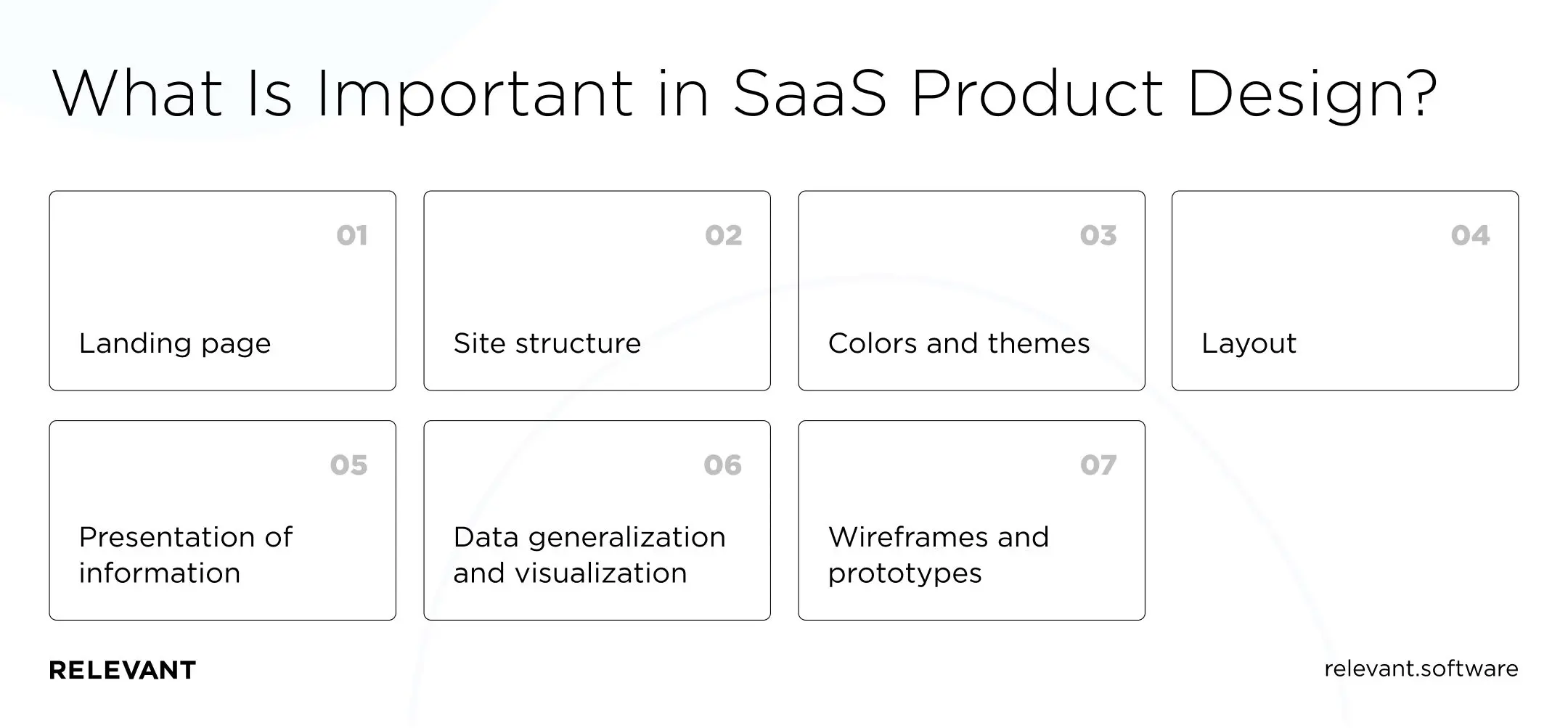
Common SaaS product design standards
You can have your perspective on the details, but these best UI design practices guide most top SaaS companies:
Landing page
As mentioned, the market is tough enough to compete, which means SaaS companies are setting superior standards for their home and landing pages.
Since nowadays web designers only have 50 milliseconds to impress the average user, a SaaS landing page should not only perfectly represent the business and its products but smoothly convert ordinary visitors into customers. The need for a catchy headline is also apparent. It grabs visitors’ attention and encourages them to scroll further.
Site structure
A website filled with text can be informative but highly boring at the same time. Your potential users may not want to read endless paragraphs of text. To avoid this problem, add images of your software, videos, graphics, animation, etc. You can frame even a set of facts attractively, so be creative!
Besides working on visual content and creating responsive web designs, SaaS companies usually use different headings, bullets, and other things that help make their text more readable. Follow the same strategy to SaaS customer success!
Colors and themes
Even the best UI/UX specialists cannot create a SaaS design that equally appeals to every user. User tastes and preferences can vary, and you need to show your user base that you value those differences by offering them many customization options.
Allow different font sizes and make sure you can darken intense colors. By the way, the popularity of the dark theme has grown significantly lately. Also, avoid using too many colors and stick to the platform’s branded color palette. Change the saturation when you want to showcase a difference in a category.
Layout
Leading SaaS websites spare no effort in designing the layout, and you should pay extra attention to it, too. The SaaS platform must provide an excellent overview and allow users to find the details of the data. Therefore, organize your layout so that it displays the critical information first.
Also, don’t forget to optimize the white balance to keep the platform simple. Create low-fidelity mockups to determine where content should go. Wireframing is an excellent process to complete before starting the final design.
Presentation of information
You should know that too much information on a single page causes an information overload that exceeds the user’s ability to process. To avoid this:
- Reduce the amount of data on the page and simplify it.
- Summarize and group related information so that users can quickly find what they need.
- Try using cards or icons to reduce the clutter of your text.
Data generalization and visualization
Users poorly understand large amounts of textual data. To help a specific audience understand essential data, select the type of data you want to display. Then, choose the data visualization type that best exemplifies the data.
Provide a sort/filter function to limit large amounts of data. You can apply the table filter to reduce the amount of data displayed on a table. That type of categorical filter shows a more precise result, often as a drop-down list. Use the filters to search for specific data types in the database by filtering context filters.
Wireframes and prototypes
Your design team must visualize the customer journey and review changes before testing or deploying them. Utilizing wireframes and prototypes lowers the margin for error during the testing and implementation phase.
How to create a great design: 10 practical tips
According to statistics, by 2026, 85% of the applications used by companies will be SaaS-based. Therefore, when creating your SaaS product, you must do everything to ensure that it does not dissolve among its competitors.
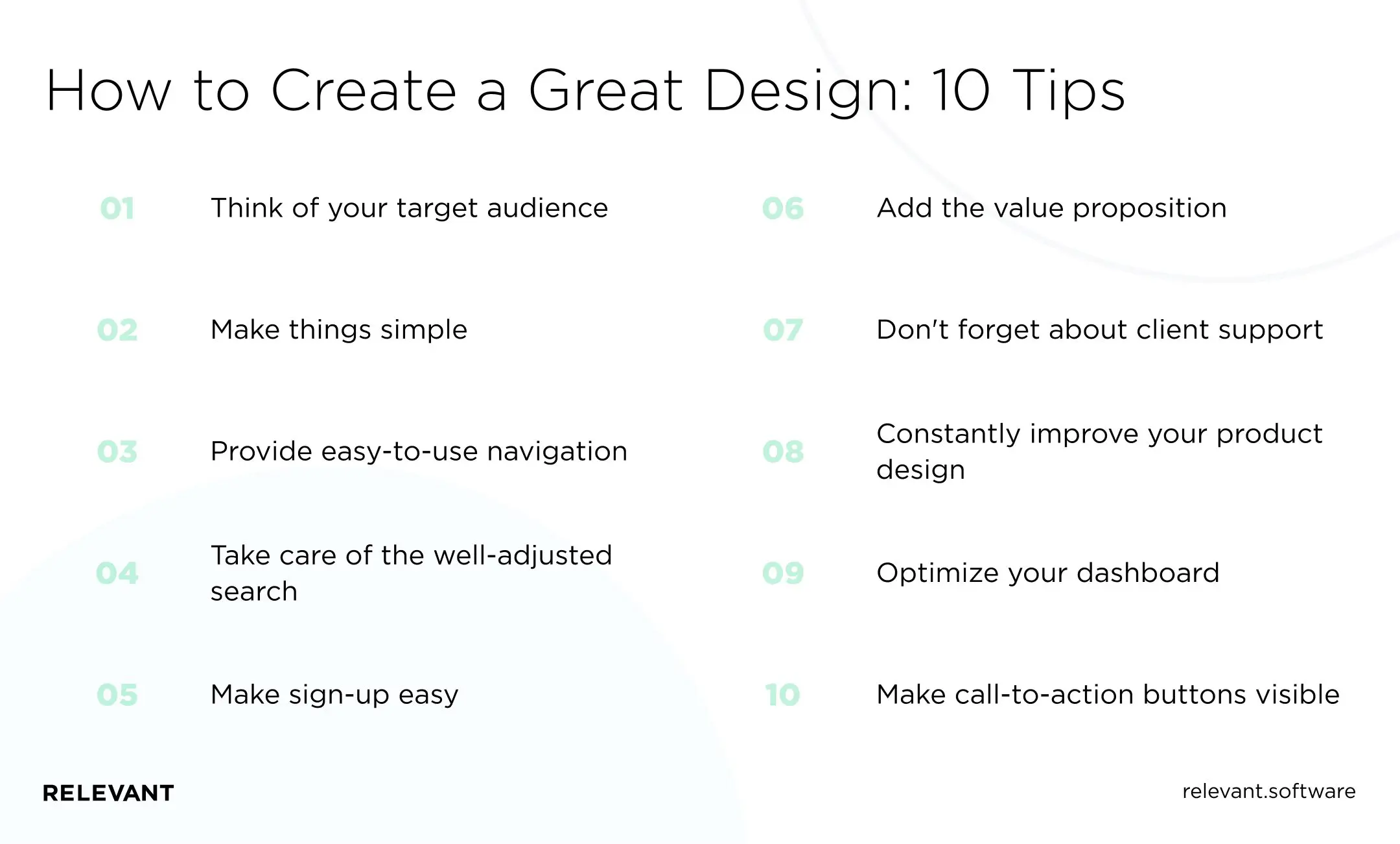
Think of your target audience
You are building your product for your target audience. What are your customers looking for? How can your SaaS product help them? To get answers, use user research tools such as images, empathy maps, and customer journey maps to gather information about your target audience. Then add relevant content and embed it into your design to attract leads and increase conversions.
Make things simple
Data and functional requirements can lead to overly complex SaaS product designs. To avoid this trap, you need to consider your user interface design and hide the technical complexity of the features behind it and your product. All of your functions – especially the key ones — should be self-explanatory.
To solve a complexity problem, identify existing problems and user pain points, and then move on to find solutions to those problems. Implement these solutions into a low or high-fidelity prototype and test it by the user.
Provide easy-to-use navigation
No matter how feature-rich or unique your SaaS product is, your users shouldn’t get lost in its functionality. Even if your software goes beyond standardized menus, try to stick with what your users already know. And write your ideas into a concise navigation bar with <10 key features of your functionality.
Take care of the well-adjusted search
Almost every web application includes some data or search functionality. And both of them perform much better if you can limit your search data based on relevant information.
Make sign-up easy
Heap’s benchmark across 79 SaaS companies shows sign-ups rise when the first step stays simple, since every extra field adds drop-off before users see value. To show the impact in real products, Reddit reported a 90% increase in new sign-ups on desktop after adding Google One Tap alongside the Google sign-in button. Keep registration to email plus password (or one-tap Google/social sign-in), then collect profile details inside the product after the first successful moment. For trials, postpone payment details until the user reaches a clear value.
Add the value proposition
As we said, your customers should immediately understand how your software can be helpful. Look at examples of great SaaS websites. You can see that a strong value proposition and call to action over the landing page folder remain essential elements of SaaS designs. Include interesting images, animations, and videos as product illustrations, but be sure to emphasize your call to action. You can add customer logos, testimonials, links to customer stories and videos, company awards, social media buttons, and more for social proof.
Don’t forget about client support
No matter how good or thoughtful your user experience is, there is always room for questions. From a design standpoint, customer service can take many forms and forms, from a chatbot on a website to emails.
The FAQ section should include high-quality content that users can understand. For chatbots, try to personalize them: GIFs, images, and text can help. A robust support system also includes clear customer customization. That allows you to guide your clients through the experience to make the best use of your services.
Constantly improve your product design
To cope with the constant development and growth of the cloud application, an experienced team will make the design adaptable and scalable for future needs. It’s easier than spending effort and time creating components adapted to the current environment. That means that your team must have a good understanding of design systems. Scalable design always pays off in the long run, but you’ll have to constantly learn from your users to get all the UX/UI tweaks and improvements to hit the bulls-eye.
Optimize your dashboard
Well-designed dashboards serve as a springboard for important functions. The most frequently used data updates pending approval and a summary of key events encourage users to keep checking back. Contextual links like to-do lists are especially useful here, as they add options to users that suit their current needs.
Make call-to-action buttons visible
CTAs help users reach their goals quickly and complete tasks easily. When customers use the app, they need to understand what happens after certain actions. Effective calls to action that convert visitors to customers are usually appropriately sized (big enough to be noticed), contrasting, and compelling.
What are the examples of good SaaS website designs?
We at Relevant have provided SaaS User Interface (UI) design services to dozens of companies. We have studied the patterns of what works and what does not. Below is our “shortlist” of good design SaaS UI examples.
Slack
This cloud-based team collaboration platform is a great example of how SaaS UX Design can facilitate customization. Slack simplifies the process, even if a new user wants to create an entire team. One of the best things about Slack is the “magic connection” that the system generates. It allows users to log in to new devices without entering their passwords.
MailChimp
That is another example of good SaaS web design. However, with a striking yet minimal design, this email marketing platform has changed its slogan several times already. Why do you think so? Because Mailchimp has gradually grown from an email tool to a marketing hub for small businesses.
Shopify
What we love about Shopify’s website is the animation of the globe on its home page, as it displays what the platform is capable of. They organized a splendid view of sales, marketing, and product management from the Shopify homepage.
Hubspot
Apart from the overall attractive design of its website, HubSpot has implemented two other important things. First, they use inbound traffic methodology to maximize customer experience, and second, they position themselves to help the business grow.
SEMrush
SEMrush is a great example of the influential organization of diverse data. You will find at least a dozen different charts for whatever website you search in their index. Traffic statistics, keyword volume, competitor charts, keyword performance, and even rich snippet data are all accompanied by visuals.
Dropbox
The acclaimed SaaS cloud backup and sync platform Dropbox is a great example of a successful SaaS website design. They reflected everything to attract users: one-page website presentation, themes, templates, clear menu, beautiful CTA buttons. Registration form and horizontal menu to the sections explaining the various functions look aesthetically pleasing.
You have now learned the UX Design principles for SaaS applications and figured out how to design a SaaS product to meet all modern requirements. But there are other nuances to consider.
How much does it cost to design a SaaS product?
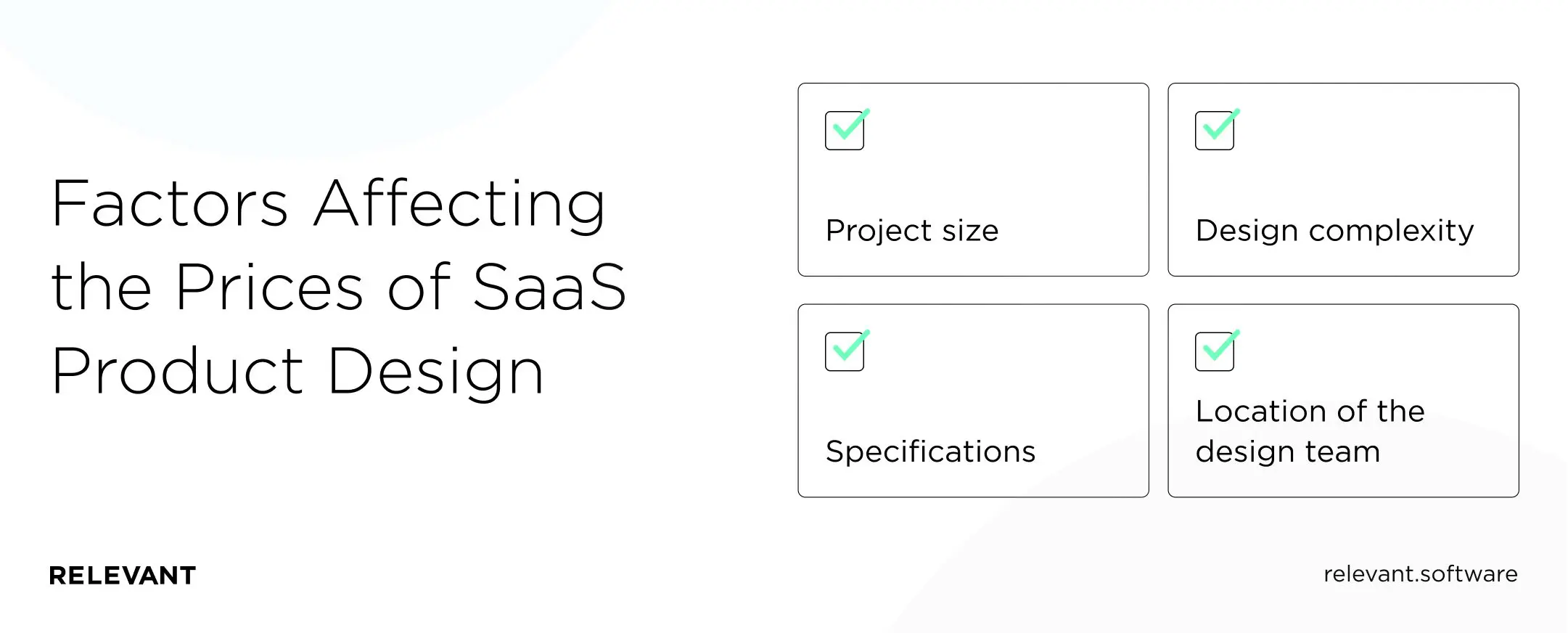
Once your business idea has taken shape, it needs to be put into practice, and you need to do it quickly. If you don’t have an in-house team or are busy with other things, you can hire a software development team from the outside, which will help you with the best practices of SaaS application design. But what is the cost of creating a design for a SaaS platform? It can vary depending on:
- Project size. That is the number of screens, pages, or modules available in the product. Optimizing and testing a product with about 40 screens and many complex features is more time-consuming and labor-intensive than it would be for a small project with 20 screens. Thus, the more screens or modules you want to add, the higher the hourly pay for product design.
- Design complexity. Complexity is one of the key factors determining the cost of product design. That refers to the level of sophistication of the product logic. In addition, the complexity can lie in the design itself, when the product must have custom fonts, icons, images, etc.
- Specifications. Of course, product development costs depend on the number of features you want to add to your product. The standard product design with a minimum set can start from 15 thousand dollars.
- Location of the design team. You should carefully choose the location of your future technology partner. That will determine the price and quality of your product. For example, the hourly rate for a designer from Ukraine is $35-56. A US designer earns twice as much. The quality in both cases remains high. So why pay more?
Relevant – your design partner
Outsourcing SaaS development and UI/UX design have helped many companies get noticed, and you will surely appreciate its benefits. All that remains is to find a dedicated development team capable of delivering amazing UX for your SaaS customers! And if you’ve read this far, consider us as a potential partner.
We at Relevant have been developing and designing SaaS products for eight years and have made dozens of our clients happy. As an example of our professionalism, we will present our cooperation with Kaizo.
Gamifying customer support with a Zendesk app
Kaizo develops a cloud-based SaaS platform to improve the productivity of support teams. Dojo Classic is a support team management platform that enables companies to train agents in real-time, track and improve their performance, and automate reports. Kaizo products are integrated with Zendesk and are available in the Zendesk Store.
Challenges
Our team challenge was transforming Dojo Classic into a first-of-its-kind gaming platform with customizable user interface elements and illustrations.
Tools
Our design team studied competitors and implemented an intuitive design in a minimalist style with gamification elements using the best app design kit. For the interface, we used React, Redux, and TypeScript. This approach makes the product scalable and easy to maintain and update.
Results
We offloaded the complex user interface by presenting it as charts on a single screen: a heatmap, histogram, bar charts, and pie charts. Our SaaS dashboard design allows users to focus on their productivity fully.
A long-term project should have an ongoing system for providing and collecting feedback from all parties. Our project management team provided management of such a system.
We also optimized the application’s overall performance and the loading speed of dashboards. The redesigned Dojo Master has gamification features to increase motivation, goal setting, and skill training.
The features we’ve packed into Dojo for Kaizo
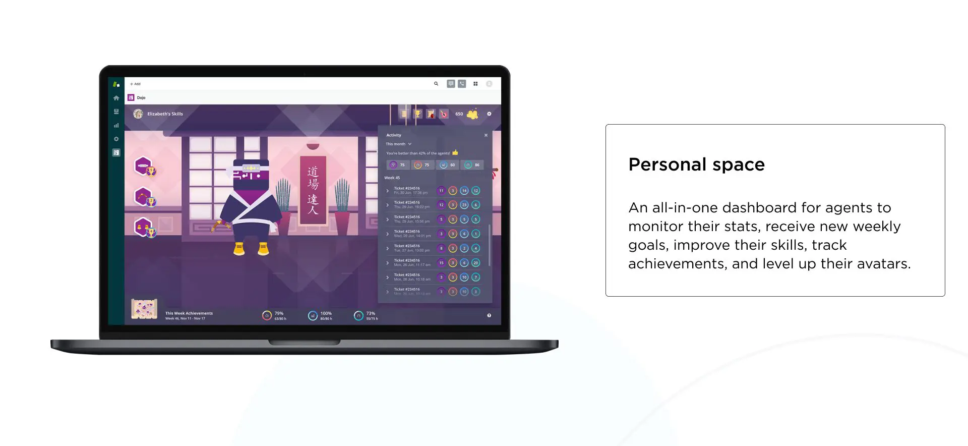
Personal space
We’ve created an all-in-one dashboard where agents can track their stats and achievements, get new weekly goals, and level up their avatars.
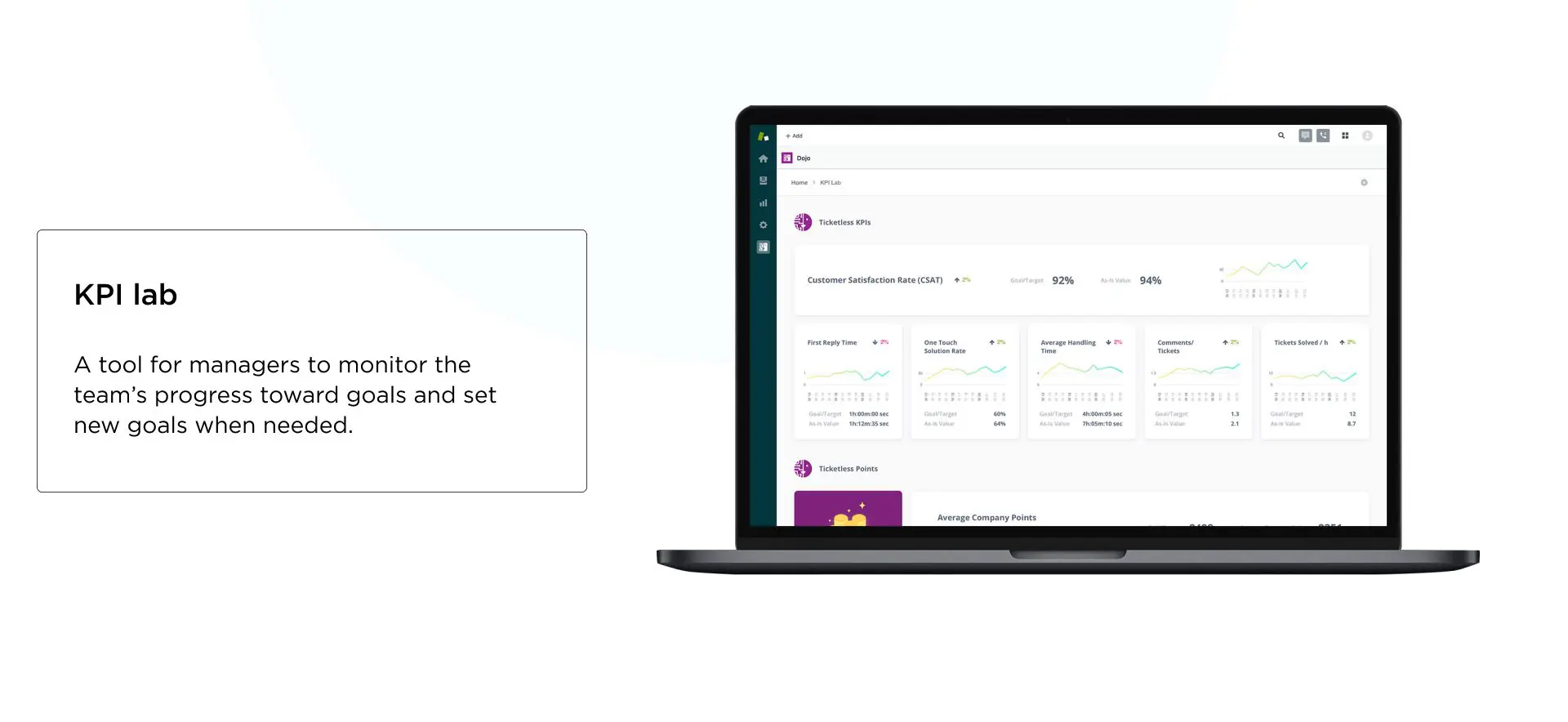
KPI lab
We also added a full-fledged tool for managers to track the team’s progress in achieving goals and setting new goals when needed.
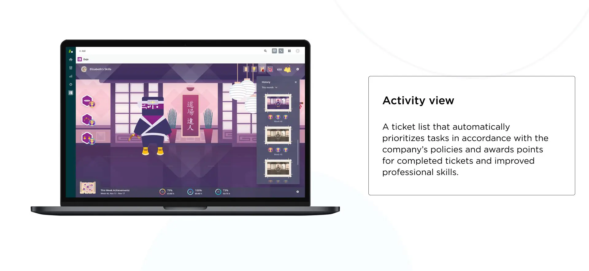
Activity view
We’ve added the ability to automatically prioritize tasks in the ticket list in accordance with the company’s policies and award points for completed tickets and improved professional skills.
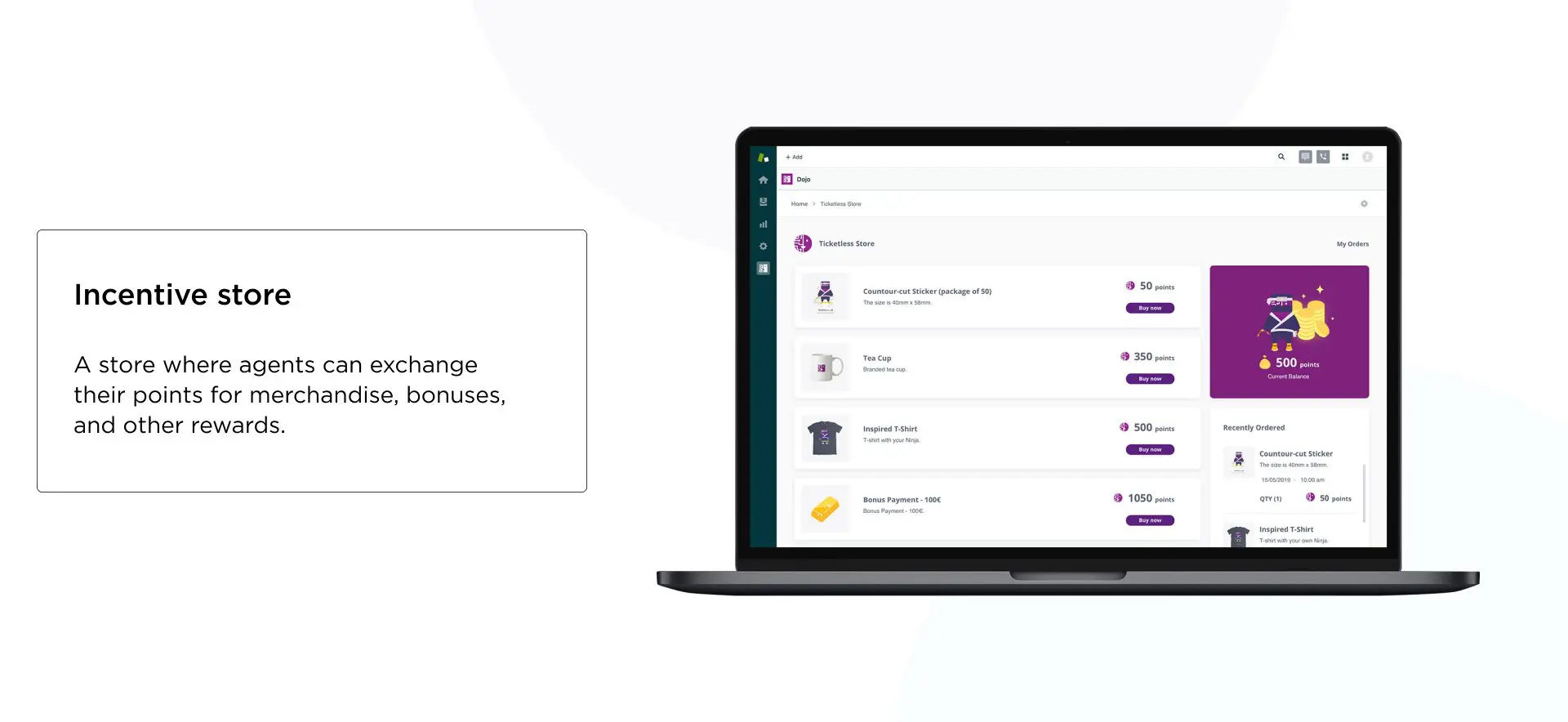
Incentive store
In this incentive store, agents can exchange their points for merchandise, bonuses, and other rewards.
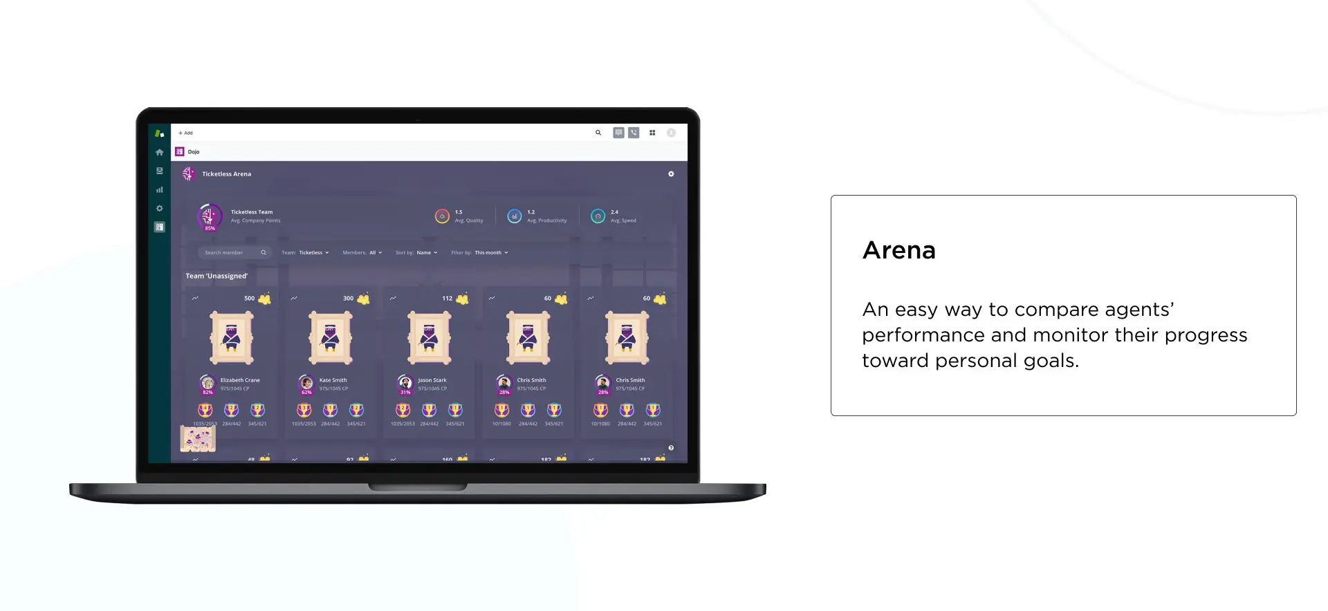
Arena
We’ve provided an easy way to compare agent performance and track their progress towards personal goals.
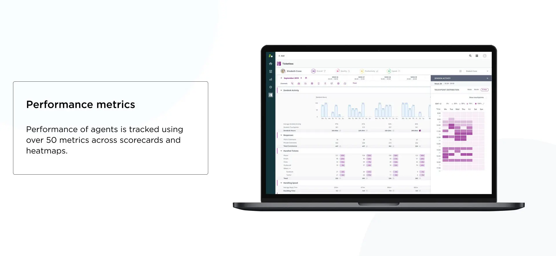
Performance metrics
We’ve expanded agent performance tracking capabilities with over 50 metrics in scorecards and heatmaps. And we are very proud that Dojo for Kaizo received a 5/5 rating in the Zendesk Marketplace.
Conclusion
So it’s safe to say that a SaaS website is the front door for potential customers. The user interface design will help buyers open your app and stay. Therefore, it is essential to make the first impression and meet your client’s expectations. If you think about them and anticipate their needs with clear functions and thoughtful UI/UX design, they won’t hesitate to decide in your favor.
For many years in SaaS application development, Relevant accumulated as much experience as possible to provide you with extraordinary U/UX design services. In terms of SaaS, they include:
- Software-as-a-Service development
- SaaS app design and prototyping
- Third-party integrations
- Migration to SaaS
- SaaS product development consulting
Our subtle approach can deliver your product with more than just mainstream compliance. Contact us if you want to reach the top in the highly competitive SaaS market!


