The Design Debt Problem: How to Detect and How to Fix It

Today’s business requires a rapid response to fast-changing market conditions. This makes entrepreneurs build their software in the most iterative way possible and use various agile development philosophies under the mottos of “deploy early and often” or “deliver and iterate.”
But getting to market quicker comes at a price.
The rush of Agile teams often results in developers releasing unoptimized applications, skipping code reviews, or ignoring accessibility issues. In turn, designers refresh the interface and add new features without considering the actual need or context for those features.
The result is a buildup of technical and design debt: a side effect of DesignOps, an iterative and experiment-based design process. But if technical debt affects the integrity of the codebase, then design debt touches the integrity of the user experience. It boomerangs returns on all decisions and design concepts, skipped to meet short-term goals.
It’s not unusual for a project to go into design debt—a natural result of software evolution. Facebook and Google have obvious design debts; we can say the same about LinkedIn and Twitter. But we will show you how to deal with this inevitable entropy. As an offshore development company with experience in web design and UI/UX strategies, we will explain design debt and the ways to eliminate it.
What is design debt?
Design is born debt-free. Take a website or product after a complete redesign. Everything — navigation, CTA, videos — looks harmonious, thoughtful, and interconnected.
But while the new products are remarkably consistent, they still leave plenty of room for optimization. Therefore, teams collect data on the latest design’s performance, identify weaknesses or missed opportunities, and integrate additional elements into the design, edging away from the original. On the one hand, these changes make the design better. But new features may not share the context of the original elements.
Indeed, adding new features over time reduces consistency, destroys cohesion, and creates a UX that feels increasingly disjointed (although quantitatively, it may work better). And at some point, you may notice that your users are not converting. It may seem counterintuitive, but greater opportunities lead to poorer customer experience. It creates an experience debt — a gap between a customer’s expectations and the company’s performance.

What is meant by “design debt”?
Design debt is the sum of all the imperfections in design processes that show up over time because of error, incompetence, innovation, and growth. It includes everything from a lack of design thinking to user experience problems that haven’t been fixed.
It happens when designs are iterated without new data, feedback, or research or when design patterns are inconsistent with the other design system parts. That also happens when teams focus solely on feature releases without prioritizing design maintenance.
All the rework and changes put off with the thought “we’ll think about it later” start piling up in the UX backlog. If you don’t do it in time, all skipped changes will turn into a snowball, sweeping away everything in its path: fixes, new features, security updates, and so on. And the situation can get out of control quickly if you don’t take it seriously.
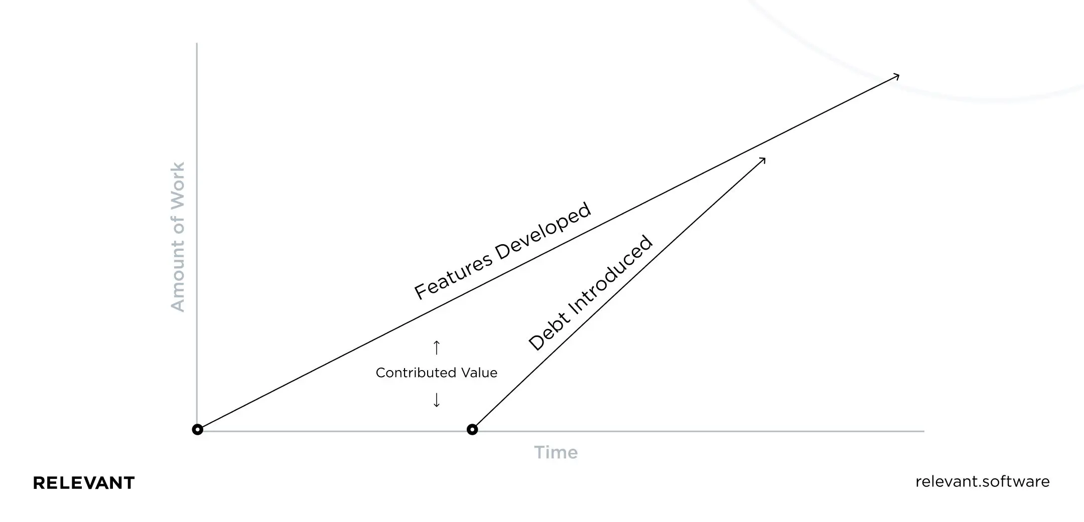
The good news is that design debt is a necessary part of software development because it accumulates as you learn new things about your business, product, and users. Obviously, it’s not possible to instantly reorganize everything you’ve already done based on what you’ve learned. If you have no design debt, you have learned nothing lately. Aaron Walter’s user needs hierarchy is a great illustration of this concept:
Design debt vs. technical debt: what is the difference?
Technical debt (also known as tech debt or code debt) occurs when development teams prefer ad hoc or trade-off solutions that cause headaches down the road. According to a McKinsey report, technology debt accounts for between 20% and 40% of all technology ownership.
Tech debt is more detectable because a poorly managed code stops working most of the time. UX debt at the same time is much easier to neglect. UX debt is more subjective, as it is you (and your users) deciding what level of quality is acceptable.
However, these two types of debt often go hand in hand. Design debt turns into technical debt, proportionally increasing the total debt. Sometimes, an update in the design system may require adjustments in five different places in the active assembly.
Too huge technical debt can slow down development, while lack of design debt can slow down new features and growth. Some organizations prioritize technical debt. However, focusing on one debt type—either tech or design—will lead only to more problems for users and more expensive fixes for your firm.

What projects are at risk of accumulating design debt?
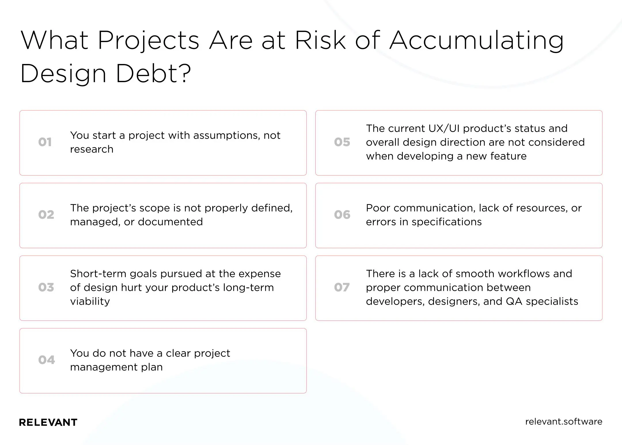
UX debt can accumulate regardless of the development methodology used. Projects that are particularly exposed to this risk typically include several of the following characteristics:
- You start a project with assumptions, not research. The user goals and problems you are trying to solve with your product are not well researched and tested during the planning and development stages. That leads to confusing navigation, floating specifications, and a complicated user journey.
- The project’s scope is not properly defined, managed, or documented. The team deals with tight deadlines and changing/growing requirements simultaneously. That makes it difficult for them to work on every feature with the same care.
- Short-term goals pursued at the expense of design hurt your product’s long-term viability. The design gradually moves beyond its original intent (elements are appended without proper attention and seem forced into layouts).
- You do not have a clear project management plan. Designers conceptualize a product following their points of view, leading to conflicting opinions, lack of consistency in design, or misinterpretation of the product vision.
- The current UX/UI product’s status and overall design direction are not considered when developing a new feature (for example, if the team is too focused on experimentation, trying to revolutionize parts while losing sight of how they fit with the rest).
- Poor communication, lack of resources, or errors in specifications, are among the reasons inexperienced designers take over the work, resulting in poor design choices, excessive complexity, and logical fallacies.
- There is a lack of smooth workflows and proper communication between developers, designers, and QA. Designers hand off a feature to developers but don’t implement it. That results in potential deviations and design flaws being overlooked or fixed at the last minute, resulting in delays, rework, and additional costs.

What are the risks of having UX debt?
The sprawl design debt can have far-reaching consequences for your business if left unchecked.
- Slow growth requires a disproportionate amount of work compared to any other change. The user experience lags, and it’s hard for you to attract new customers.
- Decreased adoption and customer satisfaction as new solutions are clumsy, and the system becomes less and less consistent.
- Slow team speed, as every time a change is made, the domino effect of extra work will start.
- General dissatisfaction of the team as they put in a lot of effort but saw too little results.
- Existing users find that using the product requires more time and effort. New users are frustrated with the learning curve.
- Competitive products with a better experience (even with fewer features) seem more attractive, increasing customer churn.

The UX debt manifestation differs from site to site, but if your conversion rate drops or your bounce rate increases, in most cases, you can assume that a decent amount of UX debt has accumulated.
Examples of design debt
We will give you an example of UX problems so that you understand the consequences of neglecting technical debt and design debt:
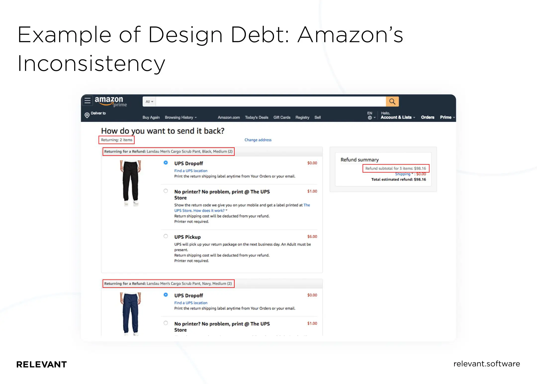
- An example of informational inconsistency in the user interface considered UX debt was Amazon. The return shipping page displayed the wrong number of returned items: the user needed to return four pairs of trousers, but the text on the page read “Return two items,” and the summary showed a subtotal of three items returned.
- Here’s another egregious case of poorly designed software costing Citi $500 million. Because of a non-obvious user interface design, instead of $7.8 million, employees accidentally sent $900 million to one of their client’s creditors. When Citi refused to return most of the money, the judge ruled in favor of the company.
- When the online game Pokemon Go was released, no one expected it to be opposed by people who don’t play it. The reason turned out to be that people who lived in certain areas suffered from the influx of crowds of players. It turns out the game labeled their homes as “training rooms” where players could meet to train pokemon.
- Another example of UX debt is a press release on Symantec’s investor relations website. The contrast of its body text was too low to be accessible. While low contrast isn’t a big deal, it’s an example of UX debt that can negatively affect the visually impaired or colorblind.

How do you avoid design debt?
There is no one-size-fits-all solution for effective UX debt management, as much depends on subjective characteristics, but general approaches will help you cope with the problem and possibly find your path.
Track and save UX debt
Common ways to track UX debt include:
- Adding UX debt items directly to the backlog for prioritization
- Recording UX debt items in a spreadsheet and then adding them to the backlog
Creating a UX debt journal will allow you to identify weaknesses in your process and clarify issues you may not have known about. You may have consciously ditched a certain UX feature because it would take a long time to get it to work—the famous “we’ll do it later.” But you may also find that some things about your product’s UX are wrong based on post-launch feedback.
A proven way to spot these issues is to conduct a UX audit to understand where the debt exists. You should check the digital service interface and look for inconsistencies in:
- User interface (links, buttons, and visual style)
- Interactive design (animation and scrolling effects, moving from page to page)
- Copy, content, and messaging (headlines, labels, and written text)
- Information architecture (content classification and navigation structures)
- Accessibility elements (visual focus indicators, contrast, text options)
Prioritize debt
Depending on development progress, you may run into a small or huge UX debt. You can solve them in order of appearance, and that’s it. But in this case, some critical issues may accidentally end up at the end of the list, where no one will remember them.
How do we sort them? Start with the ones that affect your users the most, especially in the critical parts of UX. Say you can ignore a useful option hidden in the menu tree, but you shouldn’t leave a confusing form in the store’s payment gateway. While the former is annoying, the latter can turn customers off.
Make your debt manageable
Note that we say “managed,” not “absent.” There are reasons for this. First, you will never fulfill all your UX desires technically. You will have to sacrifice something by creating debt in the appropriate backlog at one time or another. In addition, changing UX trends force you to adapt, increasing UX debt.
So, to manage UX debt, you need to categorize it.
- Intentional UX debt results from conscious decisions when you lack time, training, money, or other resources or need to follow external rules. Good ideas lost in a hurry also contribute to intentional UX debt. Shortcuts and good ideas that get lost along the way can be tracked using note-taking, task management, or issue tracker apps.
- Unintentional UX debt comes from the false assumptions you make about our customers. More often, you think you know what users like, and you build our entire site (app, product, etc.) on that presumed knowledge. You can manage unintentional UX debt by regularly running user tests, asking for customer feedback, or using best practices like A/B testing to see the impact of different designs.
Find time to pay off your design debt
Creating an organized backlog and prioritization is the way to go, but it’s not enough. You need to resolve the issues your team discovered. It is just as true for UX debt as for technical debt. If you dedicate 10% of your sprint time to finding, discovering, and fixing design issues, you will greatly improve the quality of your product or service.
You will need front-end specialists who can address UX flaws to accomplish this task. Pair “programming” between front-end developers and designers is also widely practiced.
If you don’t have one on staff, you can hire Ukraine’s outsourcing software development team. Administering your UX debt to external professionals will allow you to resolve issues faster and learn something from them.
But wait, what if my product already has design debt? What can I do to pay it up?
Iterative development and experimental UI/UX design approaches are indispensable for creating great software. However, it is important not to get too carried away. Otherwise, you end up with significant website design debt that you will inevitably have to pay off, either through a UI refactoring or a full redesign.
Refactoring
That is not creating a new design from scratch (which would defeat the purpose of an iterative process) but previously reusing used components, content, and visuals. And this is one of the best ways to pay off design debt UX.

You can turn a broken user interface into a well-designed one without changing the software’s core functionality with refactoring. Design refactoring aims to identify and address usability flaws and visual inconsistencies in elements that look unaesthetic, lack coherence, and cause user frustration. The refactoring will also help the team clarify design direction, making future UI changes easier to develop and smoother to implement.
We can describe refactoring as an extensive process comprising a series of small iterations —steps you take to incrementally make changes that maintain the look and feel of your UI without changing the core functionality. By aligning elements, adjusting font and button sizes, fixing modals, micro-interactions, animations, balancing colors, and reformulating text, designers and developers merge design patterns and reorganize user interface structure.
Refactoring allows you to constantly identify and fix visual and usability flaws, smoothing out rough edges so that your user interface does not increase the amount of unnecessary design. Your team should do this as part of their daily work. It is crucial to maintain the integrity of the user experience.
Redesign
A full site redesign can be an unnecessary risk or a great success, depending on its reasons and how you approach it. There are examples where companies redesign to give their applications a new look. This approach results in a waste of time and money, leaving the underlying problem of the application unresolved.
But if the decision to completely redesign results from careful thought, a full redesign will lead to better app performance, higher retention rates, and more sales. All you need to do is hire a software development team to take care of this task. After all, redesign is not only a designer. It involves an entire group of specialists: developers, marketers, business analysts, etc.
We can divide the redesign process into two broad phases: the UX audit and the redesign process itself.
A redesign often means restructuring an existing design into a single system. It includes typography, icons, illustrations, colors, styles of elements, and the logic of relationships between them.
Sometimes, this may also include a complete reimagining of entire screens or even fragments of a product, including removing elements, renaming or rewriting full pages, and more. It would help if you balanced the deployment of improvements without alienating people who already use the product and rely on it. This way, you won’t waste investments in your product and make your users happier.
Summing up
It is critically important not to ignore UX debt and technical debt. You should conduct regular user testing and heuristic experience reviews to identify existing debts and stop processes that create new debts. Connect all the right specialists as early as possible to establish a rhythm of finding and fixing sub-optimal elements of the experience.
Still not sure where to start? Contact us! Relevant is here to solve the problem of UI/UX design debt and get you on the right track before you accumulate too much of it.
