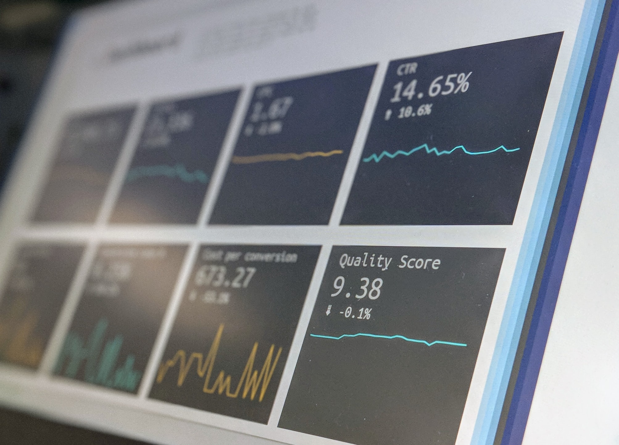
The dashboard is at the heart of many apps you use daily. It provides a high-level overview with access to the most critical data, functions, and controls. The dashboard design is not just a beautiful visualization. It is an intuitive and easy way to show the most crucial information on the app’s screen.
For eight years in software development, we at Relevant have developed many dashboards, and sometimes it was a challenge. Indeed, the dashboard is one of the most complex digital design elements. However, we combine a smooth user experience with an attractive user interface through a minimalist and intuitive design in each case.
We provide companies with senior tech talent and product development expertise to build world-class software. Let's talk about how we can help you.
Contact usDo you want to discover the basic principles our top designers use to create a powerful dashboard that end-users love? We invite you to read this article. We’ve compiled 15 dashboard design tips to help you create a great UX. Let’s start!
Table of Contents
Simply put, a dashboard is a user interface that visually displays the most important information and offers a convenient way to navigate to other areas of the application. It shows data in various presentation styles, including simple numbers, tables, and charts. The panel can also contain snapshots and links to standard or custom reports.
We believe in a research-driven approach to design, so before designing, we recommend you figure out which data your users want to see and where they want to find it. This approach makes it imperative to analyze users’ psychology beforehand, anticipate their needs and expectations, and understand their requirements.
It will “paint the big picture” by highlighting connections between data that would otherwise be invisible. So any dashboard design decision is based on:
An effective dashboard often contains data that is mutually exclusive but collectively exhaustive. There is no redundancy, but users get answers to all the critical questions by looking at the toolbar. So a good dashboard:
If an incompetent team is designing the dashboard, many problems can arise in the process, reducing the usefulness of the final product. We will look at some types of them.
One of the most common mistakes in dashboard design is including too much information. If it is limited to one page, you don’t have to cram every existing performance metric. That will make it cluttered, fuzzy, and difficult to interpret, ultimately defeating its purpose.
To resolve this issue, you must carefully edit the information to be included. If you find that your story goes beyond two or three views, you can always create more dashboards.
The appearance of a dashboard is just as important as the data itself. But even here, we face certain limitations. Using bright colors or graphics can make information easier to read, but they can also make it hard to understand for users.
To solve these problems, you need a solid understanding of the role of rendering and color. You must consider the message they convey. It is especially true of color, which can have a range of connotations. We can use it as a powerful tool to get an emotional response from the user.
Even the best solutions can have functional limitations that can reduce their value for users. Completely static dashboards that present data without letting you do anything are not popular with users. So, a great dashboard should allow you to filter, sort, and manipulate data to get the information you need, store it for later, or make a report.
One of the common problems with using dashboards is that they look completely different on a smaller screen, affecting the clarity and appearance of the data. To avoid this, you need to think about each device’s screen size and resolution when designing the control panel’s display.
Dashboards come in many forms, ranging from relatively simple single-level dashboards to more complex multi-level ones. Even though each solution has its goals, requirements, and limitations, following the basic principles will help you develop a superior UI design, no matter what the specifics are.
So, how to approach creating a dashboard? The first step is to understand the problem at hand fully. Look at existing reports, see what indicators are already being used, how they are presented, and develop a solution that combines these processes.
Besides understanding what you are trying to say, get to know who you are talking to. Does your audience know the topic, or will it be new to them? What signals will they need? For example, an analyst needs multiple data views and digs into the data for deeper insights. Alternatively, the operations manager needs to know if big changes from the norm need to be taken care of right away.
It would be best to consider these questions before moving on to the design phase. Therefore, before deciding which data and metrics to include, reflect the information architecture and maintain a visual hierarchy, scour the Internet. You will find many best dashboard UI examples, such as Sap dashboard design or Tableau dashboard design—each one can teach you something.
In addition, you can look at the Figma dashboard design library, which is based on reusable desktop application templates chosen from the most popular products.
And only after you have decided on preferences and style you can customize the dashboard according to the specific users’ needs.
You can choose between several types of dashboards.
One of the key design principles for best dashboards UX is choosing the right visualization tools.
But don’t get carried away by adding tables, charts, and graphs. Stick to a few visualization types to keep your dashboard consistent.
By the way, some of the best dash designs don’t include visualization tools for the most relevant KPIs. They appear as plain text at the top of the screen, which helps them stand out from the rest of the data.
The dashboard’s job is to show the data in the most efficient way possible and make it easier for customers to filter what they need with the tools that make sense in that situation.
Take care to create a clear and logical dashboard layout. Divide all the data into three parts in descending order of importance. Put the most significant indicators at the top, continue with trends that explain the ideas above, and end with details that allow you to delve deeper into the problem. It will make the dashboard clear and easy to read.
To create a better dashboard UX design, consider including filters. Adding filters gives customers more control over the data by selecting ranges, regions, or departments. The interface should also include a simple navigation menu and clear labels to help users find the information they need.
Creating a simple interface is one of the most important principles of modern dashboard design. It would help if you made it as easy as possible to analyze the information on the screen. Group your data into categories and underline each category with a line or box, separating the most important data from the least important. Each section requires clear labels in readable fonts.
The simple design also includes minimal colors and fonts. Use a minimalist design scheme with two or three colors for various visualization tools and one font for each type of text. Remember that all headings must use the same font.
When you think about what makes a good toolbar, you need to think about animation, detailing, click-to-filter, and time-span widgets when you make your design.
Animation is a great way to add data and images, and it’s a more advanced way to show them. An intelligent, interactive feature called “drill down” lets users analyze more detailed dashboard information about a specific item or variable. Still, it doesn’t take up too much space on the whole screen.
The core design principles of the dashboard also include giving users immediate access to the most important data. All relevant data must be available within five seconds of loading the dashboard. In web design, this is called the “5-second rule.”
Of course, a deeper investigation will take longer. Still, the most important metrics that the dashboard user most often needs during the working day should appear on the screen immediately.
When designing your dashboard, don’t forget to keep the basic principles of design psychology in mind. Be consistent with your palette and pay attention to design limitations and accessibility components. Use different colors for categorically different data, like a pie chart or a scatterplot with many other variables.
By the way, using your brand color as a key part of your palette, especially when positive indicators stand out, can help associate your brand color with a positive experience.
A good dashboard can be even more useful if users can customize and personalize it. The system can perform personalization itself. But it must be set up so that users can be identified and given content, features, or functionality that fits their role.
You can also invite users to configure themselves. They can then change the experience to suit their specific needs by tweaking content, layout, or system features.
When displaying numbers, do not specify more precision than necessary. Displaying your conversion rate to three decimal places or your revenue to the cent detracts from what’s important. In addition, to better understand the numbers, you need context. One way to do this is to display past data. You can include the same metric from the previous day or even a line or bar chart showing how the metric is being tracked over a longer period. Another way is to include average or previous highs and lows.
If the dashboard is goal-oriented, include a goal and display current progress. You can also add alerts when a metric is above or below a certain threshold to make it easier to spot problems.
Dashboards gather a lot of information in a limited space, so it’s crucial to establish a clear hierarchical relationship between elements. You can do this by visually equating similar sets of data or by grouping and separating non-essential information. Do not be afraid of blank space—it is better to leave a gap than to fill it at all costs.
Typography, element size, card design, borders, and shadows are important to help your users understand what you’re trying to show.
Next on our dashboard UI design tips list: don’t overuse real-time data to show the big picture or trend. Most dashboards don’t need to be constantly updated unless you’re tracking some real-time results. You can do this periodically, like weekly or daily.
In addition, you can implement smart alarms so that the panel itself notifies you of any anomalies. This way, your update interval and alerts will work hand in hand, saving you a lot of work hours.
Many dashboards have an element of repetition, such as the same set of metrics for multiple things. We recommend using the same visualizations and layouts between groups for better readability. Resist the temptation to use a line chart instead of a bar chart to spice things up.
Another important part of the dashboard is the labels that describe each metric or chart. They should be unambiguous to your viewers. Keep them as short as possible to avoid cluttering the board and interfering with the data. Text abbreviations can also be useful, such as “d” instead of “days” or “%” instead of “percentage.”
Before rolling out a dashboard to a large group, share it with a few people from your surrounding, listen to their feedback, and make relevant changes. Once you’ve rolled it out to the wider team, ask again for input and suggestions.
Ideally, it would help to observe how your toolbar is being used. For example, if users rarely interact with a particular visualization, change design data or remove it from the toolbar entirely. In addition, the KPIs most important to your audience now may change next month as the market and company strategy change or new initiatives are launched.
These dashboard design tips should help you create a great user experience. While each toolbar serves a different purpose, following the basic human-centered design principles helps keep your project focused on your users’ needs.
Creating a truly functional dashboard design UX requires experience and knowledge gained over years of hard work. So, if you want to use all the above methods in real life, you need experts like Relevant to help you out.
Our dedicated team of professional designers and developers can create insightful and engaging dashboards of any complexity. We provide a dynamic experience by adding attractive, interactive elements to make the dashboard more immersive and motivating. Contact us if you plan to increase your user base and popularity now and in the long term.
Do you run a UK-based business? If so, you’ve likely faced challenges in the product…
Norway's software product development services industry, which is currently on an impressive growth trajectory, is…
Computer vision and image recognition for retail obviously spark interest, with strong numbers to validate…